Stepping into the world of Procreate or any digital drawing platform can be quite a ride. This is especially true with all the features at your fingertips. You might have heard about Blending Modes in Procreate in various drawing courses and wondered what they are and how to use them effectively.
Blending Modes can dramatically transform your art piece, significantly altering its appearance and overall impact.
While this guide will help you to get started, we encourage you to experiment with these functions to get a nice feel for it.
By the end of this guide, you’ll have the skills to add depth, texture, and vibrancy to your creations with confidence. Get ready to unlock new levels of artistic expression with Blending Modes in Procreate!
By the way, even though this article is about Blending Modes in Procreate, it can also be applied to many other digital drawing software like Clip Studio, Photoshop, etc. If you’re just about to explore the magic of Procreate, check out Erika Wiseman’s fantastic course ‘Digital Drawing in Procreate for Beginners’. It covers all you need to know to get started.
What are Blending Modes?
Blending modes in Procreate are a set of options that change how the color of one layerinteracts with the colors of the layers beneath it. Think of it as determining how your colors blend together on your digital canvas. Each blending mode applies a different effect, altering the look and feel of your artwork in unique ways.
When you select a blending mode, you’re essentially choosing a rule for how colors should mix. This can affect brightness, contrast, color, and saturation in various ways, depending on the mode you choose. For example, some modes might make your image lighter, others darker, or even change the color entirely by combining the color values of your layers in special ways.
It’s a bit like mixing paint on a palette, except you have more control and can experiment without making a permanent change to your work. You can easily switch between different blending modes to see how they affect your image and find the perfect one for the effect you’re aiming for.
In a nutshell, blending modes offer a powerful and flexible way to enhance the visual impact of your art by creatively adjusting how colors interact with each other.
How Blending Modes Affect Layer Interaction
When painting in Procreate, creatives often work with multiple layers. Imagine you have a layer for your initial sketch. Then, another layer for your base colors, and yet another for shadows or highlights. In a typical setup, these layers simply lie on top of each other, like stacking transparent sheets. The resulting image you see is essentially a combination of all these layers. Each layer contributes its own element to the final picture.
However, Blending Modes bring a twist to this straightforward layering. When you choose to apply a Blend Mode to one of your layers, it’s not just idly sitting atop the others. Instead, it actively interacts with the layers below. This interaction follows the specific rules of the mode you’ve chosen. And this is where the magic happens.
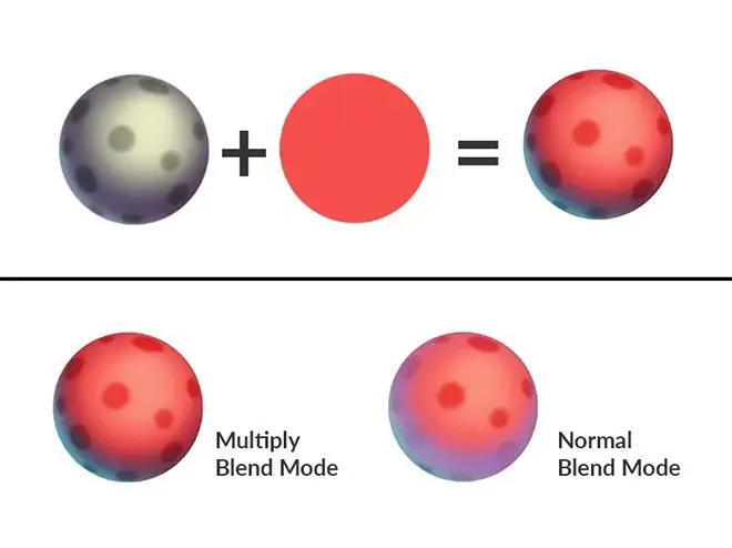
Take, for instance, the Multiply Blending Mode. When applied, it transforms the layer in such a way that it darkens the colors of the layers underneath it. This effect is akin to mixing different paints on a palette. There you have the freedom to blend colors in various ways.
Digital art has a significant advantage: You can easily reverse or change your choices. This is far trickier with physical paint. With Blending Modes, you gain an incredible level of control over how the different elements of your art interact. You can endlessly tweak and refine them.
The different Blending Modes in Procreate
In Procreate, artists have access to a diverse selection of Blending Modes. Each one offers a distinct effect that can significantly alter the appearance of their artwork. To give you a taste of what’s available, let’s explore a few notable Blending Modes:
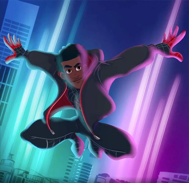
@charactercube and @michaelbills
Multiply is particularly useful for creating shadows. It darkens the colors of the layers beneath it. It’s like casting a shadow over your artwork, adding depth and dimension where you need it.
For example, if you’re working on a portrait and want to add depth to the hair or under the chin, you can apply the Multiply Blending Mode to a layer with a slightly darker shade. This creates a natural-looking shadow.
Screen is the counterpart to Multiply. Instead of darkening, it lightens the colors underneath. This mode can be incredibly useful for brightening images or creating light effects.
It is particularly useful for creating highlights or lightening an image without losing detail. If you’re painting a landscape, using Screen can help you create the glowing effect of the sun or create reflections on water.
Overlay is an interesting blend of Multiply and Screen. It has the unique ability to darken the darks and lighten the lights in an image. This mode is fantastic for adding both depth and contrast. It’s a go-to choice for enhancing the overall dynamic of your artwork.
This mode is fantastic for adding vibrancy and contrast to an image. For instance, if you want to enhance the textures in a still life painting, applying Overlay can make the colors pop. It can also give the textures more definition.
Add (also known as Linear Dodge): This mode is the mode for intensifying brightness. It’s great for creating areas of intense light or glow effects.
It can be especially useful for scenes with strong light sources. For example, streetlights in a night scene or the glowing eyes of a character. The Add mode will make these elements truly stand out and look luminous.
Difference: This mode creates a psychedelic, invert-like effect. It often leads to creative and unexpected color combinations. It’s especially useful when you’re looking to experiment and add an unconventional twist to your art.
Difference is particularly valuable when you want to create artwork with a surreal, otherworldly quality. It’s excellent for making complex, intriguing patterns and textures that stand out.
Darken: Think of Darken mode as your digital art sidekick. It ensures that only the darkest hues shine through between your base and blend layers. If the blend layer and the base layer have the same color, Darken makes no change.
Color Burn: Ready to add some drama? Color Burn takes its cues from traditional darkroom techniques. It deepens the dance between light and shadow, adding that perfect dramatic flair. It’s all about enriching those mid-tones and dialing down the highlights for a moodier outcome than you’d get with Multiply.
Linear Burn is the emo cousin of Multiply. It reduces the base color’s brightness, bringing out a deeper, more intense scene. It avoids overdoing saturation, though. It’s perfect for adding depth and contrast, especially in the darker areas of your artwork.
Darker Color is like the wise guru of Blending Modes. It looks at the big picture by considering all RGB channels together. It’s great for ensuring the darkest tones make their mark across the spectrum. They don’t get lost in the details.
Watch free lessons about Blending Modes in Isabelle Straub’s course ‘Procreate made easy’ here.
Lighten is the beacon of hope in your Blending Modes. It always chooses the brightest path. It’s like having a digital flashlight that highlights the best and brightest of your base and blend layers. Unless those layers are the same, then the Lighten Mode makes no changes.
Color Dodge: If you’re aiming to brighten your artwork with a touch of sunshine, Color Dodge is your go-to. It lifts your art by enhancing the contrast. This makes those mid-tones pop and the highlights sing. It’s inspired by traditional dodging techniques.
Lighter Color acts like a lighthouse, guiding ships in the night. It illuminates the brightest colors in your artwork. It does this by taking a holistic view of the RGB channels, ensuring that only the lightest colors make it through.
Soft Light: For those times you’re seeking a touch of subtlety, Soft Light gently kisses your artwork. It adds a whisper of shadow or light based on the luminance. It’s like the soft glow of sunrise or sunset, enhancing your art without overwhelming it.
Hard Light is the bold and brave hero of blend modes, merging the powers of Multiply and Screen to bring dynamic intensity to your artwork. It’s fantastic for making a statement, but remember, a little opacity adjustment goes a long way.
Vivid Light is the daredevil, taking the drama of Overlay and Soft Light to the next level. It’s all about contrast, turning the dial up on anything darker or lighter than middle gray for that punch of visual excitement.
Linear Light is for thrill-seekers. It mixes Dodge and Burn for vivid results. Best used with a gentle touch, as it’s known for its strong effects.
Pin Light is the wildcard, doing double duty by darkening and lightening at the same time. It removes all traces of mid-tones for a unique, high-contrast look. It’s like the special effects guru of blend modes, perfect for experimental art.
Hard Mix: Ready for a bold move? Hard Mix strips down your image to its bare essentials. It offers an almost cartoon-like simplicity with vibrant colors and stark contrasts. Adjusting opacity here can help you find just the right balance.
Exclusion is the peacemaker. It’s similar to Difference but gentler on grays. It creates subtle contrasts without going to extremes. It’s like having a soft conversation between blacks and whites in your artwork.
Subtract is the drama queen of blend modes. It dramatically darkens colors by pulling the brightness down. It’s especially noticeable in lighter areas, giving a deep, intense effect that’s hard to ignore.
Divide: Think of Divide as Subtract’s optimistic sibling. It brightens up the darker areas and lets the light ones gently fade into the background. It’s perfect for achieving an ethereal, dream-like quality in your art.
Hue is the chameleon, changing colors without losing the essence of your artwork’s saturation or tones. It’s fantastic for tweaking the mood without altering the underlying details.
Saturation is like a mediator, balancing the vibrancy of your artwork. It blends the base layer’s hue and luminosity with just the right amount of saturation from your blend layer.
Color is your coloring book hero. It preserves the shadows and highlights of your base layer. It fills in the hues and saturation from your blend layer. It’s ideal for bringing greyscale images to life with a burst of color.
Luminosity is the illuminator. It holds onto the hues and saturation of your base layer while embracing the light and dark from your blend layer. It’s like painting with light to bring your artwork to life.
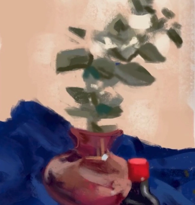
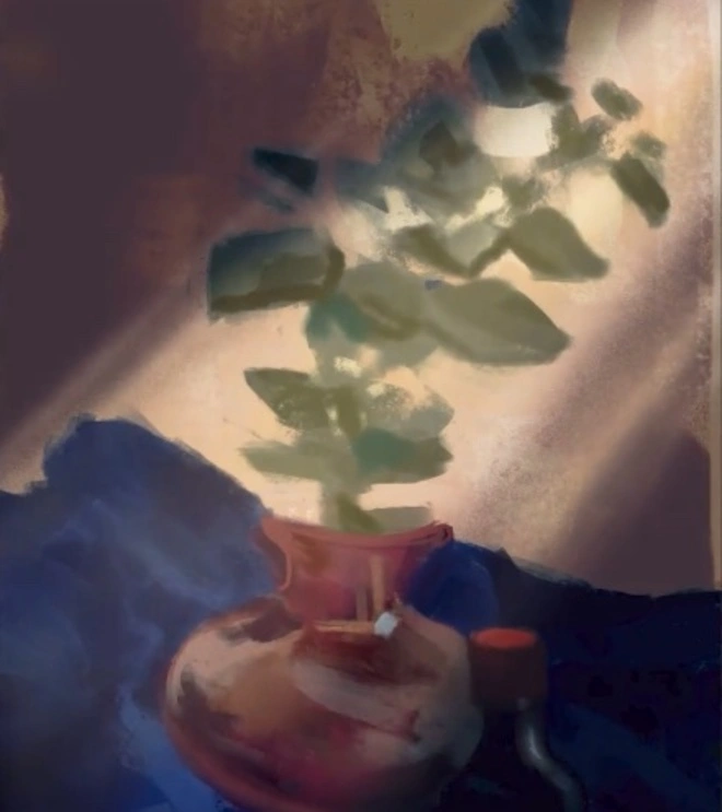
BeforeAfter
Blending Modes are your arsenal for bringing depth, emotion, and texture to your digital art.As a beginner, the best way to understand them is to experiment with them. Try applying different modes to your layers and observe how they change the appearance of your artwork. There’s no ‘right’ or ‘wrong’ way to use them, so feel free to play around and see what exciting effects you can create!
How to Apply Blending Modes in Procreate?
Let’s break down how to access and apply Blending Modes in Procreate into simple steps. This process is quite straightforward once you get the hang of it:
Step 1: Open Your Project in Procreate
Start by launching the Procreate app on your iPad.
Open an existing project or create a new canvas where you want to apply Blend Modes.
Step 2: Select the Layer You Want to Edit
In your Layers panel, tap on the layer to which you want to apply a Blending Mode. This panel is typically located on the right side of the screen.
Remember, Blending Modes will affect how this layer interacts with the layers beneath it.
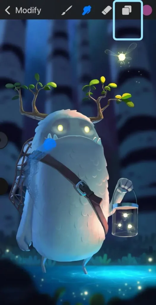
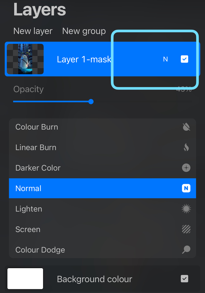
Step 3: Accessing the Blending Modes Menu
With the desired layer selected, tap the ‘N’ icon located next to the layer’s name in the Layers panel. The ‘N’ stands for Normal, which is the default blending mode.
Tapping this icon will bring up the Blending Modes menu, displaying a list of all available modes.
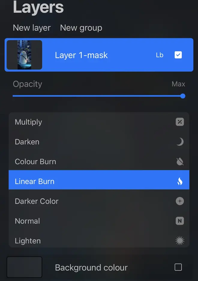
Step 4: Choosing a Blending Mode
Scroll through the list of Blending Modes. You’ll see options like Multiply, Screen, Overlay, and many others. Tap on the Blending Mode you want to try. This will apply the mode to your selected layer.
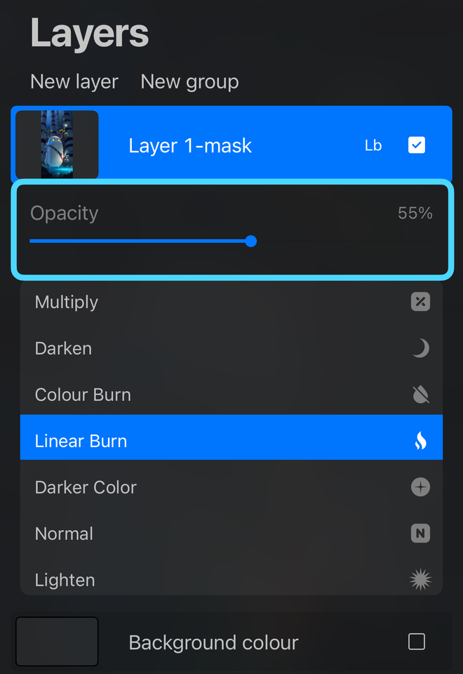
Step 5: Adjusting the Opacity (Optional)
After selecting a Blending Mode, you can adjust its intensity or effect by sliding the opacity slider. The slider is found in the same menu. Reducing the opacity lessens the blending mode effect. Increasing it makes the effect more pronounced.
Step 6: Preview and Adjust
Once you’ve applied a Blending Mode, you can see its effect immediately on your canvas. Feel free to experiment by switching to different modes and adjusting opacity until you achieve the desired effect.
Step 7: Finalizing Your Choice
Once you’ve applied a Blending Mode, you can see its effect immediately on your canvas. Feel free to experiment by switching to different modes and adjusting opacity until you achieve the desired effect.
Remember, the key to mastering Blending Modes in Procreate is experimentation. Try different modes and settings to see how they change your artwork.
Advanced Tips and Tricks for the Use of Blending Modes in Procreate
Once you’ve got a handle on the basics of Blending Mode, there are some advanced techniques that can elevate your artwork even further. Experienced users can explore combining Blending Modes with Layer Masks or Alpha Lock. This can help them achieve more nuanced and sophisticated effects.
Combining Layer Masks with Blending Modes
Layer masks in Procreate are a powerful tool when used in conjunction with Blending Mode. By adding a layer mask to a layer with a Blending Mode, you can control exactly which parts of your artwork are affected by it.
This technique allows for precision and subtlety. It enables you to blend layers in specific areas while leaving other parts untouched. For instance, if you’re working on a portrait, you can use a layer mask to apply a Blending Mode only to the hair or the skin. This lets you selectively adjust the tones and shades in those areas.
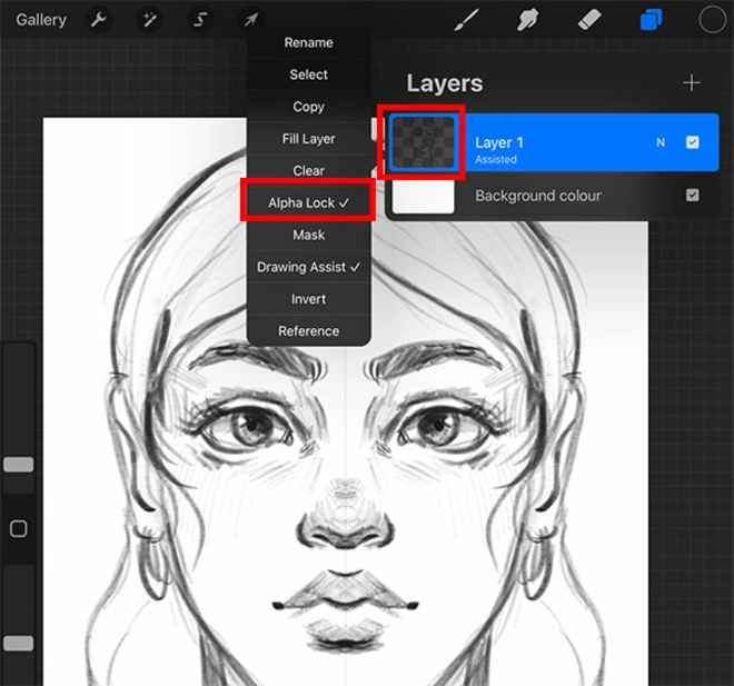
Combining Alpha Lock with Blend Modes
@rheatibbey
Alpha lock is another feature that works well with Blending Modes. When you apply alpha lock to a layer, it locks the transparent parts of the layer. This means that any painting or blending you do will only affect the existing pixels, not the transparent background.
By using Blending Modes on layers with Alpha Lock, you can fine-tune the colors and effects on a very detailed level. This is especially useful for adding textures or lighting effects to specific parts of your layer. It doesn’t affect the empty areas.
These advanced techniques open up a world of possibilities. They allow you to manipulate your digital canvas in intricate ways. Just try them out!
Common Pitfalls When Using Blending Modes in Procreate and How to Avoid Them
When starting with Blending Modes in Procreate, you’ll run into several common mistakes pretty quickly. Don’t worry, we all make them in the beginning. This is part of the learning curve. To spare you some of those learnings, here are the most common mistakes beginners make:
1. Over-Reliance on Certain Modes: Beginners tend to repeatedly use the same few modes, like Multiply or Overlay. Try to diversify your use of Blending Modes to get more dynamic and varied results.
2. Ignoring the Base Colors: If you’re not considering the underlying colors of layers, it can lead to unexpected results. Always keep in mind and understand how the base colors will interact with the chosen mode.
3. Forgetting Opacity Adjustments: It’s important to adjust the layer opacity with a Blending Mode. This can lead to overly harsh or subtle effects. Adjusting opacity can finely tune the effect of the Blending Mode.
4. Ignoring Layer Order: When you’re applying Blending Modes, the order of layers in Procreate is crucial. A common mistake is not considering how the placement of layers affects the outcome. It’s important to experiment with the order of layers to get the effect you want.
5. Misjudging Color Theory: Blending Modes are significantly influenced by color theory. A lack of understanding in this area can lead to undesired color interactions. You should get familiar with basic color theory to improve the use of them.
If you want to learn more about color theory, Rhea Tibbey’s course ‘Introduction to Color Theory’ is perfect for you. Check it out!
6. Neglecting to Save Versions: Be careful when you’re experimenting with Blending Modes. It can lead to irreversible changes. Beginners often forget to save different versions of their work, which can be a problem if they want to go back to an earlier stage. Always make sure you’re saving different versions of your artwork.
The best way to get to know all the Blending Modes ist to try them out. Save every version of your test and remember what you did. This is the best way to learn and improve your skills.
Conclusion
Exploring the world of Blending Modes is like unlocking a treasure chest. It is full of artistic possibilities, each one ready to add that extra sparkle to your creations. These magical tools offer you the power to blend, mix, and bring to life the vibrant, the subtle, and the unique in your artwork.
We encourage you to dive in, play with these functions and have fun with it! The journey of discovery is filled with surprises. With each experiment, you’re not just practicing. You’re growing and shining as an artist in a wonderful way.
There so many blend modes and the effects can be so subtel that it can be hard to know where to start. Your post is a great introduction. It’s a great help. Thank you.
21 Draw offers online courses and books on how to be a better artist for students of all skill levels. Our contributing artists and instructors are the best in the world.

 Ryan
Ryan


 Gift Cards