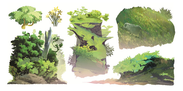
Do you ever struggle with objects in your environmental pieces looking unrealistic or flat?
The devastating feeling one might get after finishing a piece because “something looks off” is relatable to many of us—especially when it’s over something that feels incredibly minor, like the flatness of an object.
But don’t fret! Today we’re going to go over some concepts and tips Lorenzo Etherington shares in the Illustrator’s Guidebook 1 to help us fix this problem! Let’s learn about these concepts together and how we can apply them using a simple exercise so that the next time we draw objects into our environments, we can do so confidently!
There are three sections to the depth of field: foreground (closest to us), midground (in between foreground & background), and background (farthest from us).
Notice how the elements that are closest to us have the most detail! You see, even the amount of detail must be accurate to what we’d see in real life to help convey realism! So the next time an object is drawn into your environment, think about where it is located in regards to depth. For example, if you’re placing an object far into the background, avoid drawing too much detail because it’s unlikely that the human eye would be able to see much detail if the object is far.
When objects are drawn without considering the perspective of the environment they’re placed in, there’s a high chance they’ll look flat or out of place. So whether it’s a one-point perspective, two-point perspective, or three-point perspective, make sure your objects are also adhering to the perspective grid in place! The best part about using a perspective grid is that we don’t have to worry whether or not our objects will look cohesive with our environment or with each other because the grid ensures that it’s taken care of for you!
“Notice how objects have more visual weight when you’re mindful of how they occupy space. You can then add shadows to the different angles to show depth.”
– Lorzenzo Etherington
This wireframe exercise is so simple and yet, it builds a strong habit of thinking about objects in 3D and visualizing them in perspective. First, ask yourself, “Which basic shape is this element similar to?” For example, in the image above, the tree trunk is similar to a cylinder, the leaves on the tree are basically spheres, and the rocks look like rectangular prisms!
Then draw a wireframe around the object, similar to the basic shape you thought of. Follow the shape of the object as best as you can and be sure to consider the perspective of the environment as you do so! If you don’t want to draw your own objects or find your own images, feel free to use our FREE practice sheet!
If you wish to further improve your environment drawings, access our FREE environment design lessons on composition, color/light, rendering, and more in Michael Bills & Kenneth Anderson’s course “Environment Design”!
Bree is a digital artist based in California. She enjoys helping new artists grow and loves to create artwork of her own.