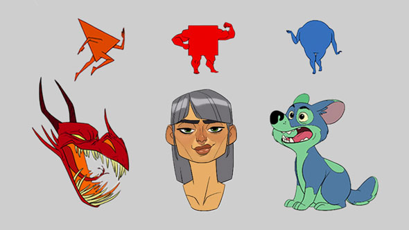
We probably all heard that shape language is important. But do you know why? 👀
Shapes are super underrated. They allow for simpler, cleaner designs that help express a character’s personality, making them more memorable.
Shapes also help the audience understand a character’s personality at first glance which is helpful in many contexts!
Randy Bishop discusses this fascinating topic in his course “Fundamentals of Character Design”. Without further ado, let’s explore various types of shapes and delve into how to use these shapes in our designs!
Geometric shapes include squares, triangles, and circles. Squares embody the feeling of strength, reliability, and sturdiness. Triangles can seem dangerous, dynamic, and chaotic. Circles are friendly, cute, and pleasant-looking.
Natural shapes are organic shapes found in nature, such as leaves and flowers, representing life and movement. Having grown up with nature all around us, natural shapes give a sense of familiarity! When used in character designs, these shapes can also be associated with personality traits like being wild, adventurous, and free-spirited.
Abstract shapes are a combination of different kinds of shapes, more experimental, and random at times. Some abstract shapes are recognizable, like numbers and letters. These shapes are usually asymmetrical.
See how the subtle changes in the shape design within a character’s clothing change the overall vibe of the character?
The first example includes all of our geometric shapes: triangles, squares, and circles. This design is complete, and there’s nothing “wrong” with it.
However, in the other designs, Xiao intentionally builds the character with a shape motif in mind provoking a stronger sense of personality.
We looked at how to use shape language in clothing but what about the character itself? One of the most effective ways to help your audience understand the personality of a character at first glance is through their overall shape language.
Even though the discontent expression of our chef character is maintained in each example, each variation suggests a different vibe or feel.
This shows how much shape language can influence the way we perceive a character.
Contrast in personality between characters often makes for an interesting story and accentuates the uniqueness of each character. This contrast can be pushed further through shape language! Whether it’s shown through their clothing, hair, and/or silhouette, visual contrast brings out the differences in our characters even more!
If we saw the male character on his own, we could easily tell that Randy intended to draw him as strong, masculine, and dependable.
On the same note, the female character seems gentle, playful, and motherly even without the male character next to her. Some might argue that our female character doesn’t look gentle and looks rather strong and assertive judging from her facial expression and pose.
However, when these two characters are placed side by side, the contrast in their shape language makes the female character appear softer and more gentle next to the big, square male character. The difference is much more apparent when they are next to each other.
Draw characters using the three primary shapes!
Want to further improve your character design skills? Access some FREE lessons in Randy Bishop’s course, “Fundamentals of Character Design”!
Bree is a digital artist based in California. She enjoys helping new artists grow and loves to create artwork of her own.