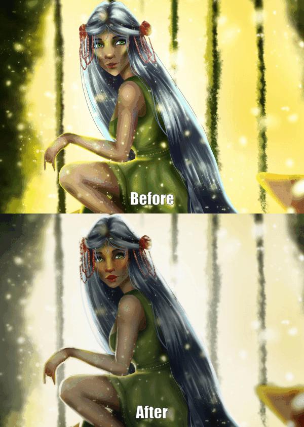
Want to know how to make your subjects POP in your art?
With some simple color theory tricks, you will be able to achieve this effect every time! Today’s drawing lesson is from my course “Introduction to Color Theory” – check it out to learn how to choose the best colors for your illustrations!
When it comes to making the focal point of an illustration stand out, there are a couple of things we can do to influence the visual hierarchy of our work.
Visual Hierarchy describes elements within an illustration that guide the viewer’s eye through the content in a specific order of importance.
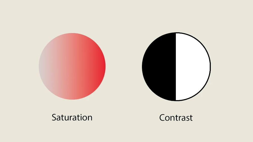
Whilst visual hierarchy is affected by a variety of things, including composition, leading-lines etc, color plays a large role. There are two main factors we can influence when it comes to this: saturation and contrast.
So, let’s get into how you can use them to your advantage!
Let’s start with saturation.
Saturation describes how vibrant or vivid a color appears, ranging from dull or muted tones to intense, vivid hues.
Colors with high saturation are vivid and rich, while colors with low saturation appear more muted or washed out.
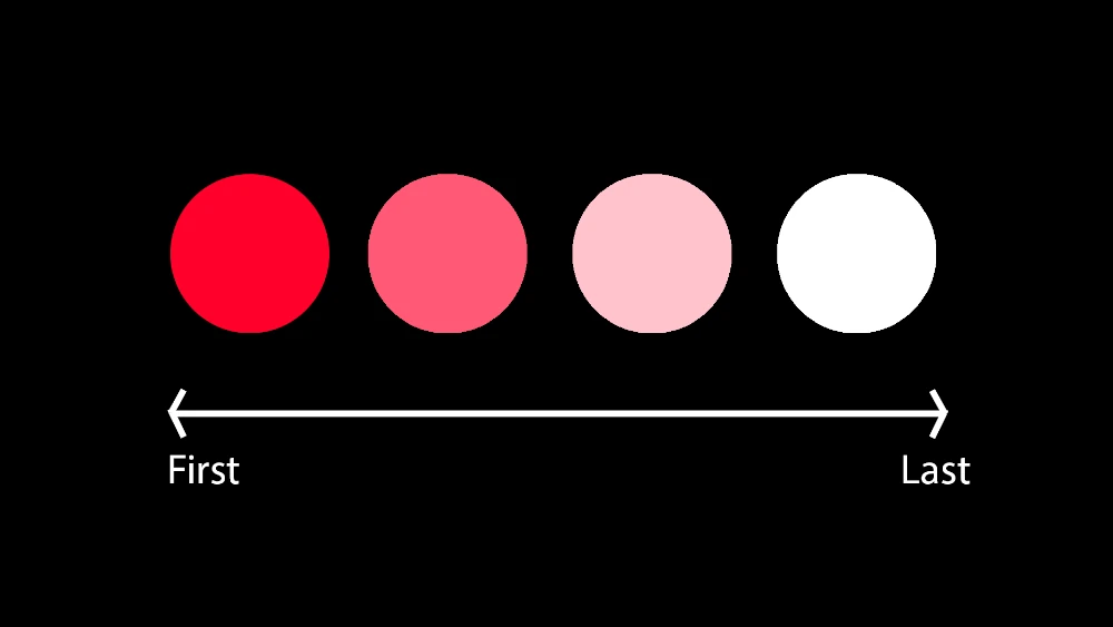
The most vibrant and saturated colors in your illustration will catch your audience’s attention first, especially if those colors lean towards red, orange, or yellow (warm-toned colors)!
Consider a simple portrait from one of the drawing lessons in my course: I often aim to make the eyes the focal point. One effective method is to heighten the saturation of colors around the eyes.
Take, for instance, two versions of the same portrait: one with desaturated colors around the eyes, and the other with vivid, saturated hues.
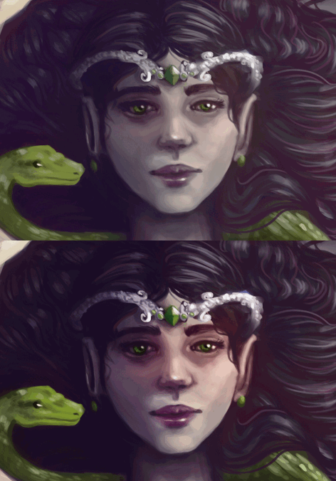
Which one draws your attention more to the eyes?
Personally, I find the saturated version to be far more captivating.
If you are drawing a full-body illustration of a character then consider ways you can add saturation to the character’s face. Maybe they have some warm tones in their cheeks or around their eyes. Maybe their jewelry or hair has a POP of vibrant color.
On the flip side, toning down the saturation in other areas of your illustration will make them less noticeable, shifting more attention to your focal points.
To make sure your focal point is really attention-grabbing, you will also need to consider contrast.
Contrast in art is the difference between light and dark areas in a picture. It’s how much brighter or darker one part is compared to another. High contrast means a large difference between light and dark, while low contrast means a smaller difference.
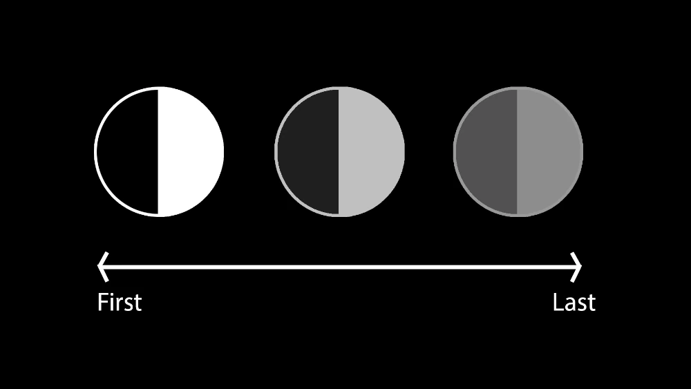
Value contrast can be used to make things stand out, create depth, and set the mood in an artwork.
Just like vibrant colors command attention, areas of high contrast can do the same. It’s commonly understood that as an object recedes into the distance, its contrast should diminish.
Therefore, it’s crucial to ensure that your focal points possess the highest contrast while minimizing it in other areas of your work.
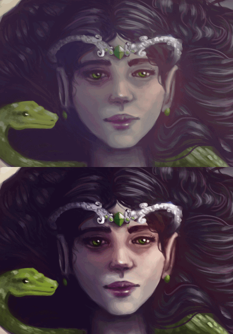
In this portrait example from the drawing lessons in my course, increasing the contrast around the eyes while reducing it elsewhere on the face significantly accentuates them.
Are you ready to test these color theory tips on your own art?
Why not give the drawing lessons from my course a try and boost your color skills!
While there are no strict rules, warm-toned colors like red, orange, and yellow tend to catch the viewer’s attention more easily. However, the effectiveness of color schemes may vary depending on the context and intent of the artwork.
Experimentation is key. Try adjusting saturation and contrast in different areas of your artwork to see how it affects the visual hierarchy and focal points. Don’t be afraid to test out various color, value and saturation combinations to achieve the desired effect.
For feedback from one of our certified teaching assistants you can share your artwork via our community forum feature on our website – found under each course via the “Get Feedback” button. Additionally, the 21 Draw Community Discord provides a space for our students to share their work and receive feedback from your peers.
Rhea is an Australian artist with a Bachelor of Animation and Art Direction. She is passionate about illustration and has worked as a Producer and Concept Artist on multiple short films! She aspires to spread her love of art to 21 Draw students everywhere!